FAP Interior design and creativity
Back

FAP Interior design and creativity

Let’s delve into the FAP creative and manufacturing process, with Norberto Marzani and Alessandra Carboni.

Let’s delve into the FAP creative and manufacturing process, with Norberto Marzani and Alessandra Carboni.


“We’re basically observers, and we try to create products that reflect the environment we all live in”.
Norberto Marzani

Every new FAP collection seems to bring on board a whole series of different inspirations and aesthetics, which take shape on stoneware and ceramics and share a single vision that inspires each individual collection.
Norberto Marzani, Marketing Manager, introduces us to the FAP creative process.

The creative process starts out from a careful analysis of interior design styles and trends, or rather lifestyle inspirations and trends, of which interior design is just one of the expressions. 
A survey carried out indicates that we as consumers can all be divided up into five macro-clusters or groups: conscious, reassuring, nostalgic, functional and unconventional.

None

This classification allows us to define the desires of each consumer, or Occupant, as we prefer to call them, so we can tune into their needs and meet them with home furnishing products and solutions able to respond to their actual requirements and desires.

As in the world of fashion, we release new collections twice a year, and we’re always seeking to go one step further, to ensure our ideas are always of interest to the Occupant.

So the challenge we face is to come up with lasting furnishing products in which the desires of the Occupant intersect with the point where we overcome our limits. 

The point where these two needs coincide results in a new material research that combines contrasting materials on the same tile: distinctively matt, satin-finish or opaque ceramics, enhanced with glossy glazes that create patterns able to stand out against them depending on the interplay and direction of the light.

This innovation – also from a technical point of view – is something we sought and achieved in the collections launched in 2020.

Moving on from inspiration, let’s take a peek into the production process, with FAP Product Manager Alessandra Carboni.

Although this is an industrial process, there’s still plenty of scope for craftsmanship ideas and creativity. Numerous artists and craftsmen collaborate with our workshop, working on ceramics and glazes and helping us understand the most interesting processes we can use to create designer tiles, characterised by imperfections, calcifications, polished parts and mineral residues that seem trapped in the earth.

Our ceramic production system retains a craftsmanship approach throughout rather than an industrial conception… When it comes to shaping dreams and creative ideas at production level, we find that the process intersects constantly with the dreams that are being created all the time in a ceramic workshop.

None

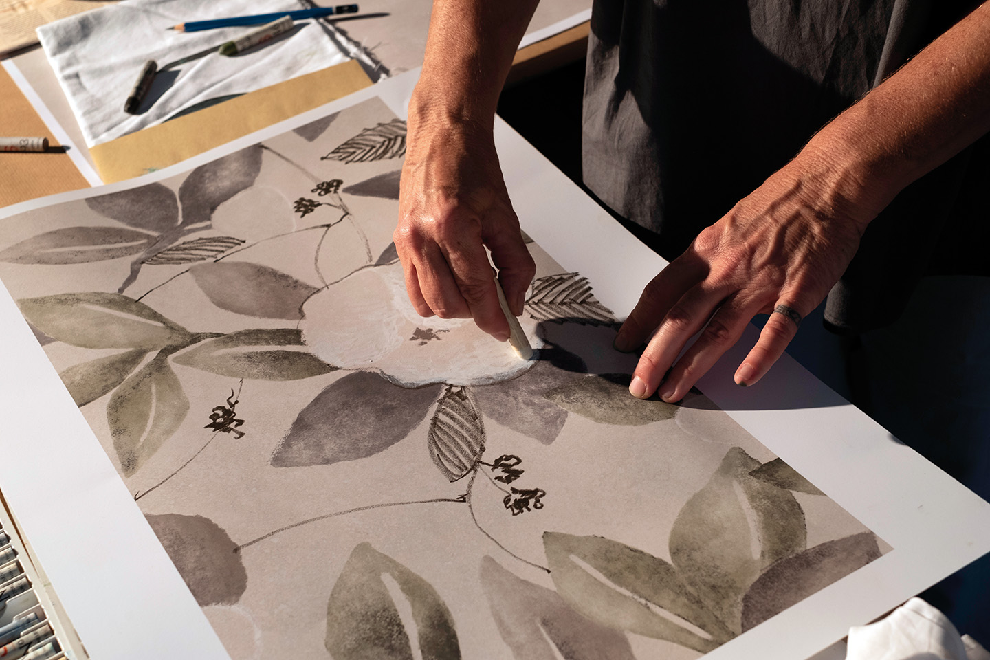
We’re continually amazed each time we observe little tests, new colours, newly arrived grits…and every time we realise that the manual work of the craftsman is not too far removed from the FAP manufacturing process.

An in-depth exploration of each individual collection is like a journey, and it’s a journey that has inspired one of the latest collections.


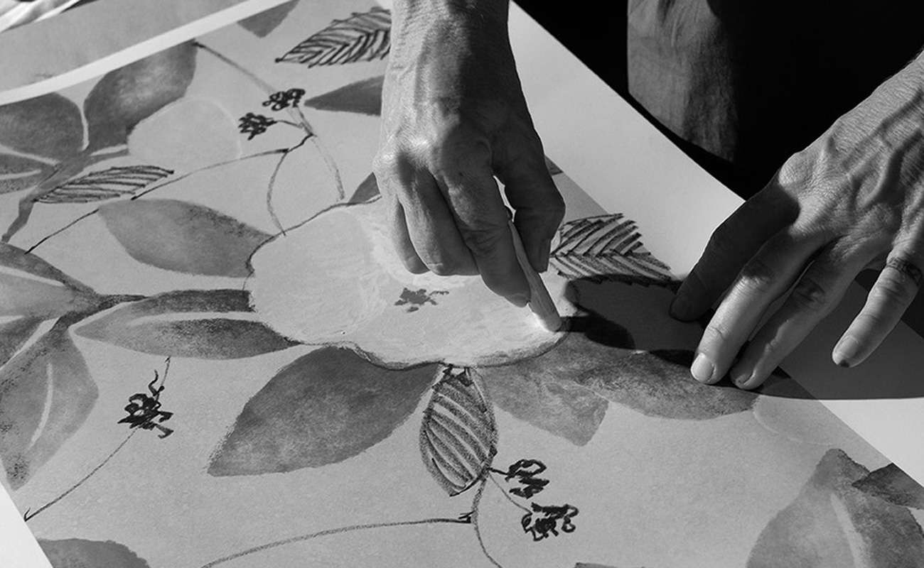
Norberto Marzani tells us how Summer originated.

We started designing Summer in March 2020, when for the first time in our lives we found ourselves having to stay at home. It’s not something we were used to, and we’re still not, unfortunately, so we felt completely disorientated. At that time, what we wanted most was to get out, to escape from the cell we found ourselves imprisoned in virtually overnight. This is where the idea of a journey came from.

We thought: “We’re being told that no-one can come to Italy, and that we can’t go anywhere…Okay, then we’ll give our clients – both at home and abroad – an idea of what Italy is and the sensations it transmits”. We’re fortunate enough to travel a lot for work, since FAP products are sold worldwide, 30% in Italy and 70% internationally; so we’re aware of the high regard Italy is held in. It’s one of the best-loved countries in the world, so we thought we’d take a slice of Italy all around the globe, to satisfy the desires of our customers.

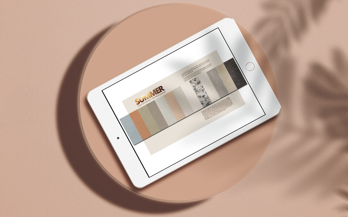
The collection headline refers to an Italian summer, because we wanted to go on a journey, and to create a product able to take us on a journey.
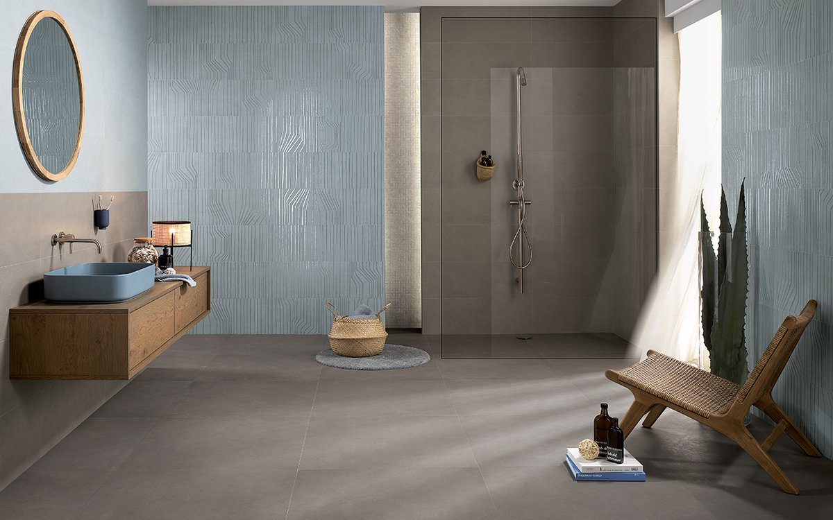
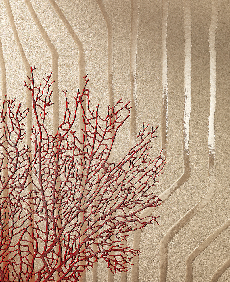
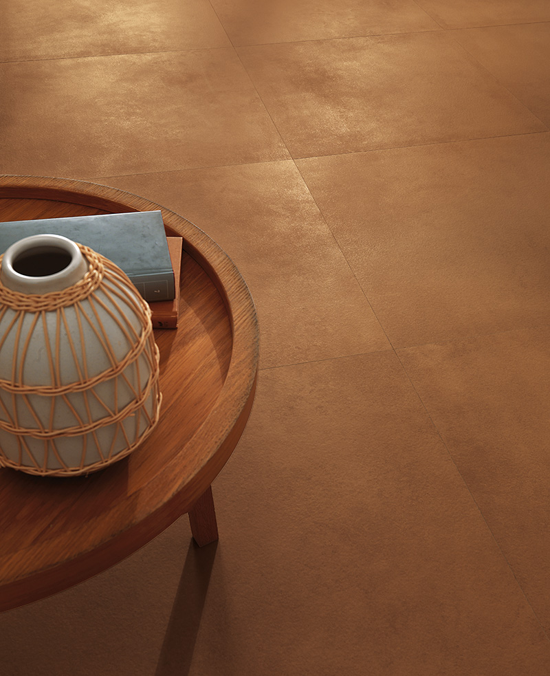
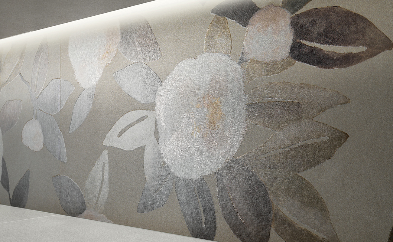
Summer is not just a name, though: it’s a whole substantial concept.
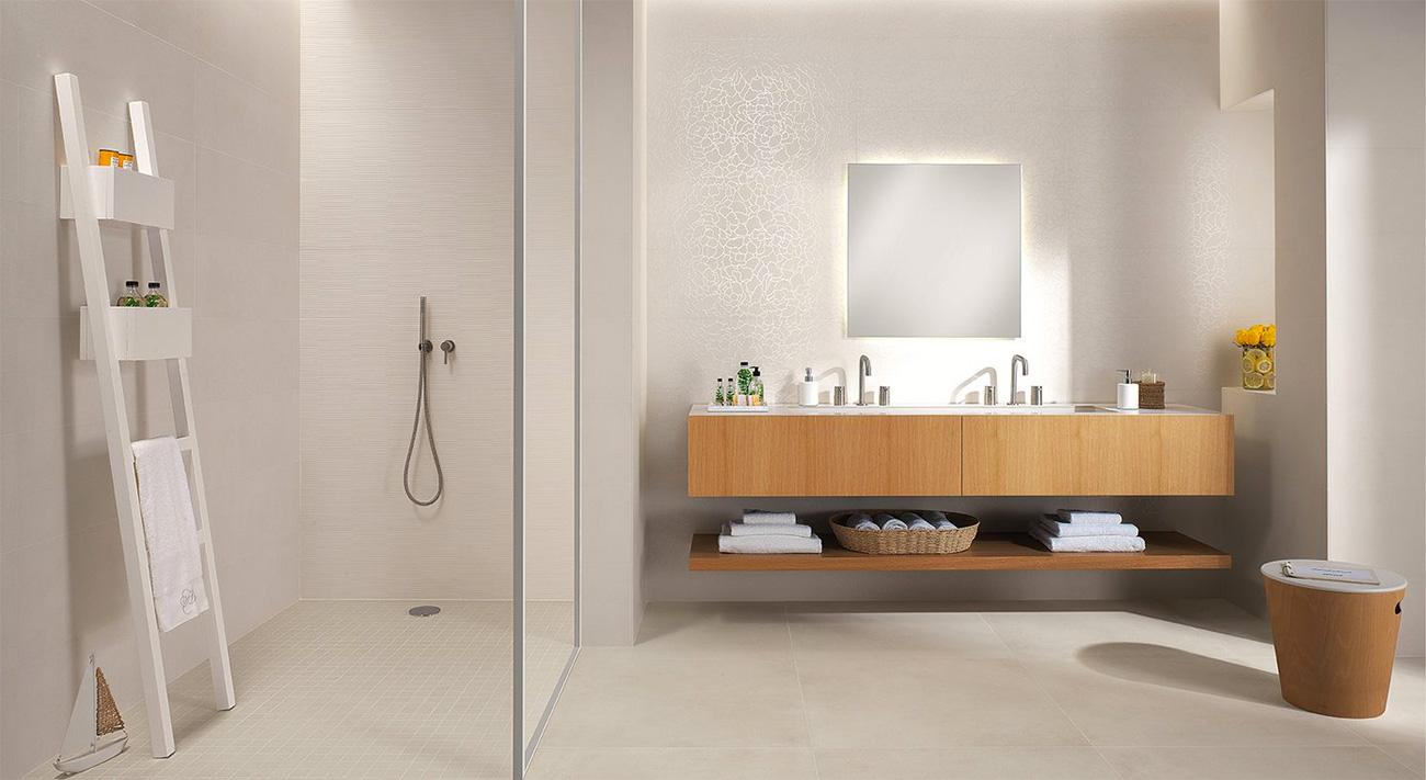
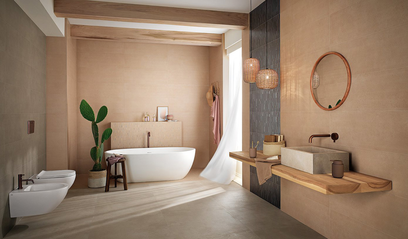
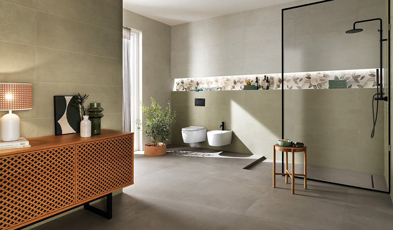
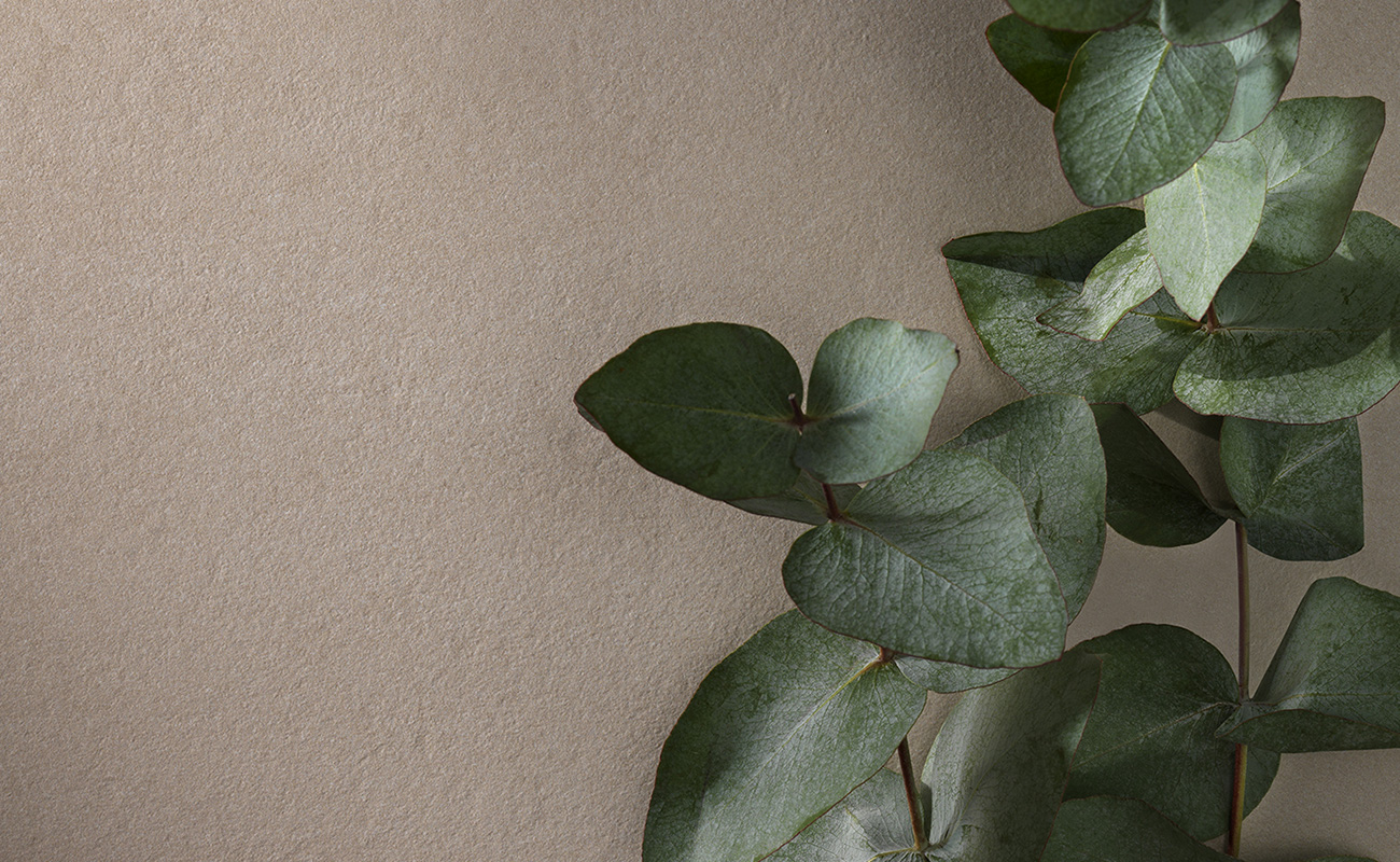
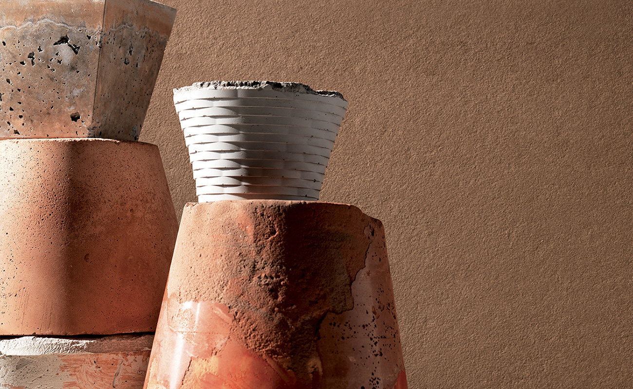
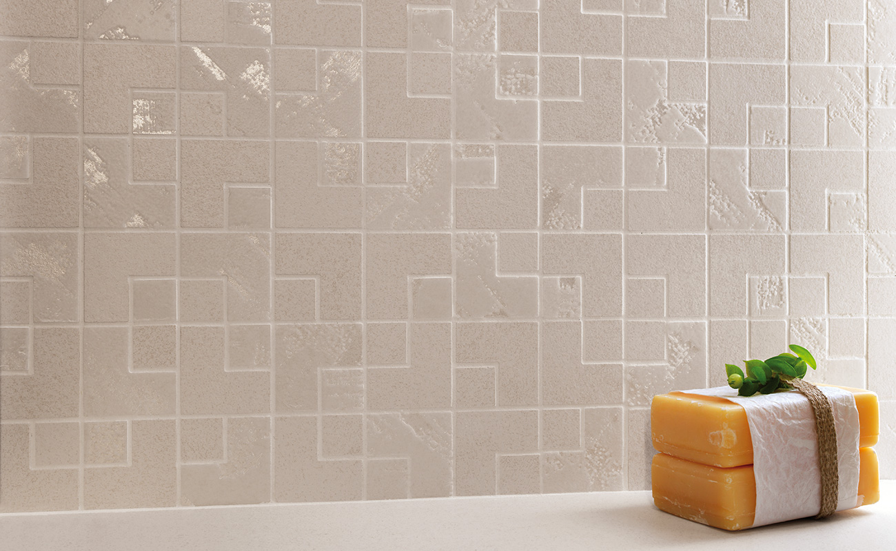
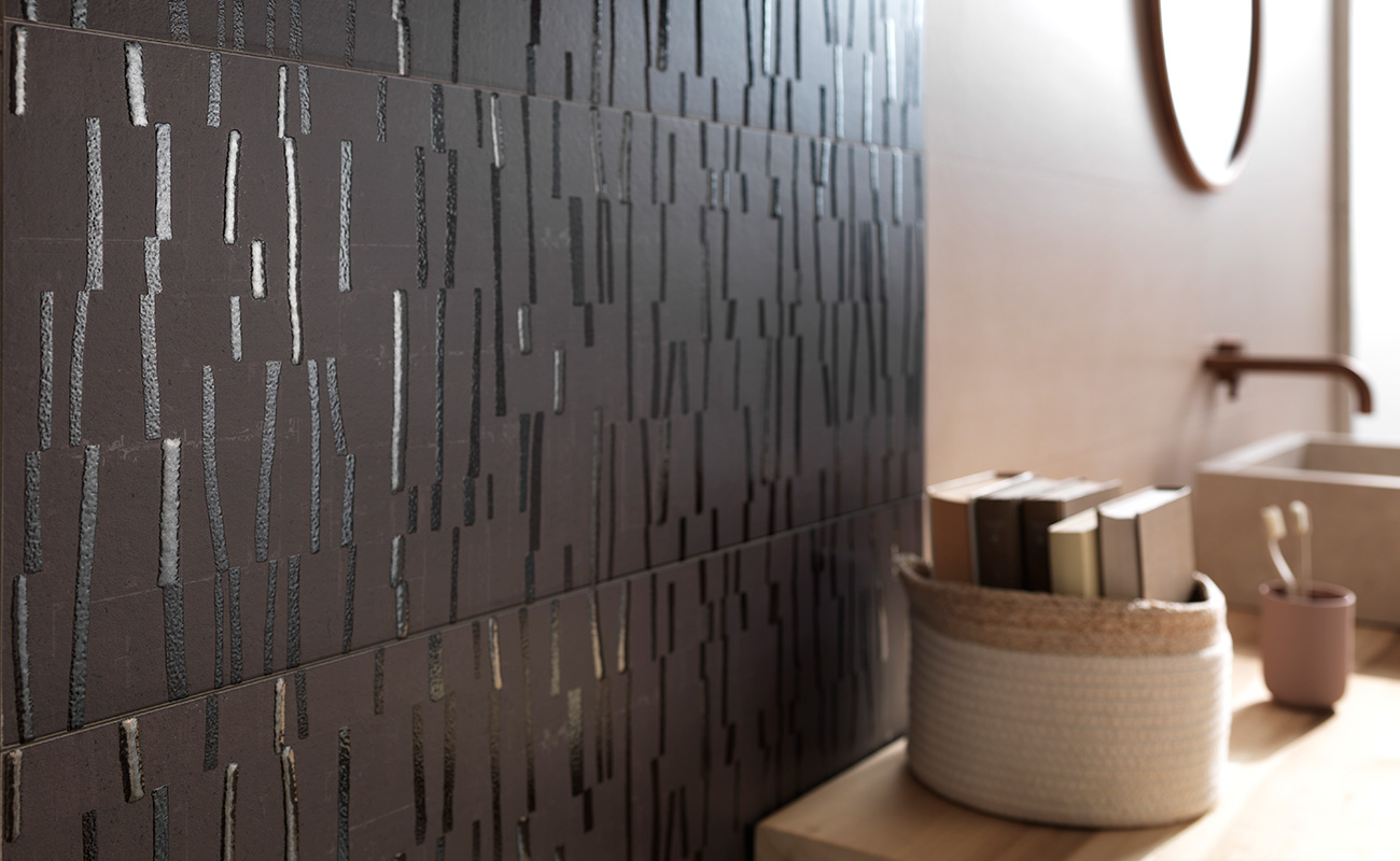
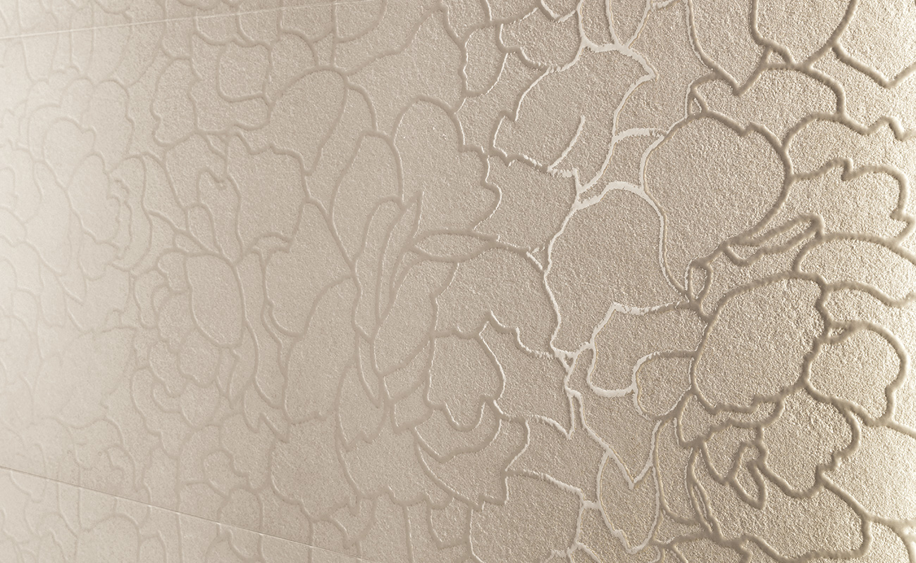
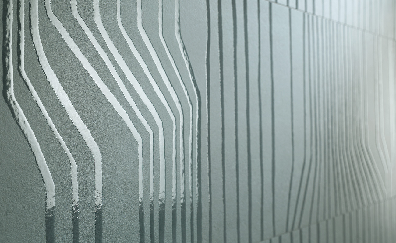
We went to work on Italian landscapes, taking a look at the earth, the villages, the colours of the scenery, and the materials and sensations created by these scenarios.
Our aim was to transmit the essence of the Mediterranean in a ceramic product, and we hope we’ve succeeded in evoking the sensations awakened by these landscapes. 

None

Oliva is inspired by the olive groves of southern Italy, Sciara by the Sciara del Fuoco on Stromboli, Terracotta by handicraft objects…

This is a palette inspired by our experience of colour.
After all, the founding aim of this brand is to interpret colour on ceramic material: painstaking, in-depth work on colour has been in FAP’s DNA since 1969.

Summer features colours with their very own scent, an eternal fragrance that derives from being soiled and softened by a patina of grey that gives them a vintage air.

These timeless colours are never garish or brash, with a modest, veiled allure that runs right through the project, with the aim of offering the Occupant a lasting, timeless, distinctive solution.

The most interesting, intriguing aspect, both for us and for the customer seeking a covering material, is how to strike a balance between innovation and invention on the one hand, and tradition and lasting beauty on the other.

Mission accomplished, thanks to the craftsmanship experimentation explained here by Alessandra Carboni.

A craftsman created large panels for us, with little elements of earth, pigments and micro-sand, composing a palette of colours we took inspiration from in terms of both tone and texture, observing how the colours emerged from these mixes of earth and sand. 
So Summer has more of an artisan concept than it might seem, because the end product is much less dusty: we’ve reproduced the material effect of the earth with a micro-structure, composed of a combination of lots of different colours and materials and then given a satin-look finish.

None


This complexity is particularly evident on the floor, a surface that generally doesn’t have the decorative power of a tile or 3D wall.
How did you obtain this result?

It was the first time we’d conducted such an important study of overlaying different effects.

We worked on the matt/shiny effect, and on the structure, overlaying a series of little techniques and technologies to obtain a slightly textured floor, with a rich thickness and material appearance.

At the same time, we worked on an extreme opacity, and here we developed small shiny effects, a closely targeted, atomised shiny effect with an almost holographic appearance.

The result is a decorative floor, and when you walk on it, the sensation is one of a series of brushstrokes of material on top of the colour.

Summer is conceived for interior design, both residential and contract. In what settings and environments would you say it’s the perfect solution?

Summer is perfect for any setting in which the aim is to transmit the warmth of the sun, the light of the Mediterranean, positive, calm sensations. Summer turns on the light.
It lights up the surroundings with its colours, its streaked effects. And this brightness is complemented by technical performance that makes it suitable for numerous applications, from softer concepts to projects where greater resistance is required, such as restaurants or commercial settings subject to heavy foot traffic. One of the most popular areas for application remains the bathroom, however.
Our wall tiles are a light, easy solution for the bathroom, because they are simple to cut and pierce to accommodate bathroom furnishings, and are complemented by decorations, special trims and 3D surfaces that make it possible to create made-to-measure solutions.

None

How to furnish a home with Summer

We recommend teaming the range of warmer shades with the cooler shades, creating blocks of colour and exploiting Summer’s decorative potential to the full. For example, the colour Brezza can be teamed with Ombra to obtain a warm, Mediterranean effect, while the combination of the blue shade Mare with Ombra shapes a more Nordic atmosphere.

What we’ve sought to experiment with are combinations of varying intensity, able to create different light effects, aided by the variety of decorative elements, created with gradients of light that allow for a transition from the cooler light of the north through to warmer, more Mediterranean temperatures: stripes, petals and translucent flowers are used to create extremely interesting patterns on the wall, with decorations simply shaped by the light!

None

Another interesting combination is terracotta with grey: a dash of warm colour, toned down by a neutral shade to create something new, contemporary and minimal; sophisticated, yet at the same time warm and engaging.

The cooler, Nordic shades are also able to give off warmth though, because light goes to work on the surfaces, the porous micro-structure and the earthy colours.
So pale blue and brown can be combined to recreate the atmosphere of the sea in winter, on a clear day with calm light.

None

Another splendid combination is Oliva with Vento.
The natural beauty of green teams with a more rigorous grey, embellished with a floral decoration that offers a permanent window on springtime, creating a setting with an original yet romantic look.

The Magnolia decoration, which runs right along the lit-up niche, derives from a drawing on paper created by an artist and designer using different techniques, including the naïf technique, and then adapted for serial reproduction on ceramics: an extremely delicate phase to maintain the continuity of the design, while creating clusters of glaze and material for a contrast between matt and glossy effects.

None

The Summer Catalogue is a little guidebook the Occupant is free to use to plan their journey.

It forms part of the research effort that precedes the creation of each FAP collection, and reveals the creative baggage of what has been conceived and designed. The catalogue offers a series of home furnishing ideas, suggesting possible combinations and pairings and taking a look at the potential of the collection and the decor elements.

Depending on the combinations and the amount of colour used, the Occupant can create different landscapes, so interior design becomes a more complex, more creative, more personal process, and makes the difference when it comes to home furnishings.

None

So our best advice for furnishing your home with Summer is to choose your destination and set out on your own personal journey.
 

Explore the Catalogue