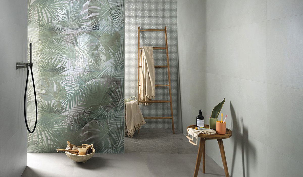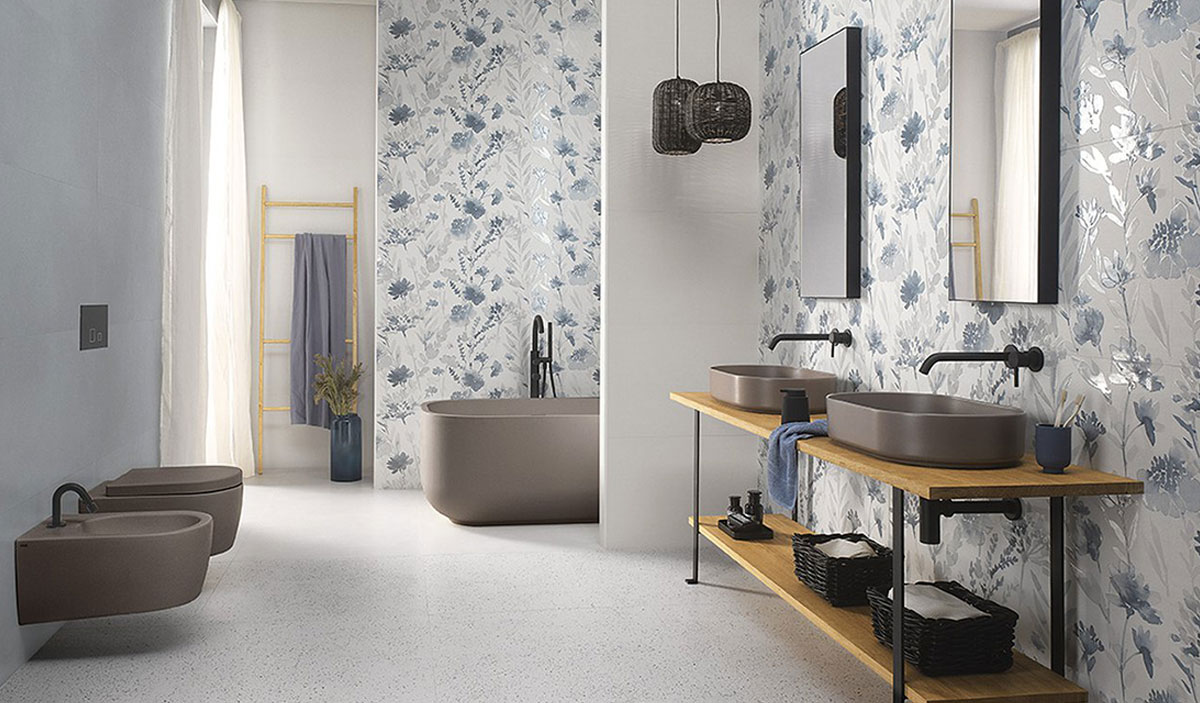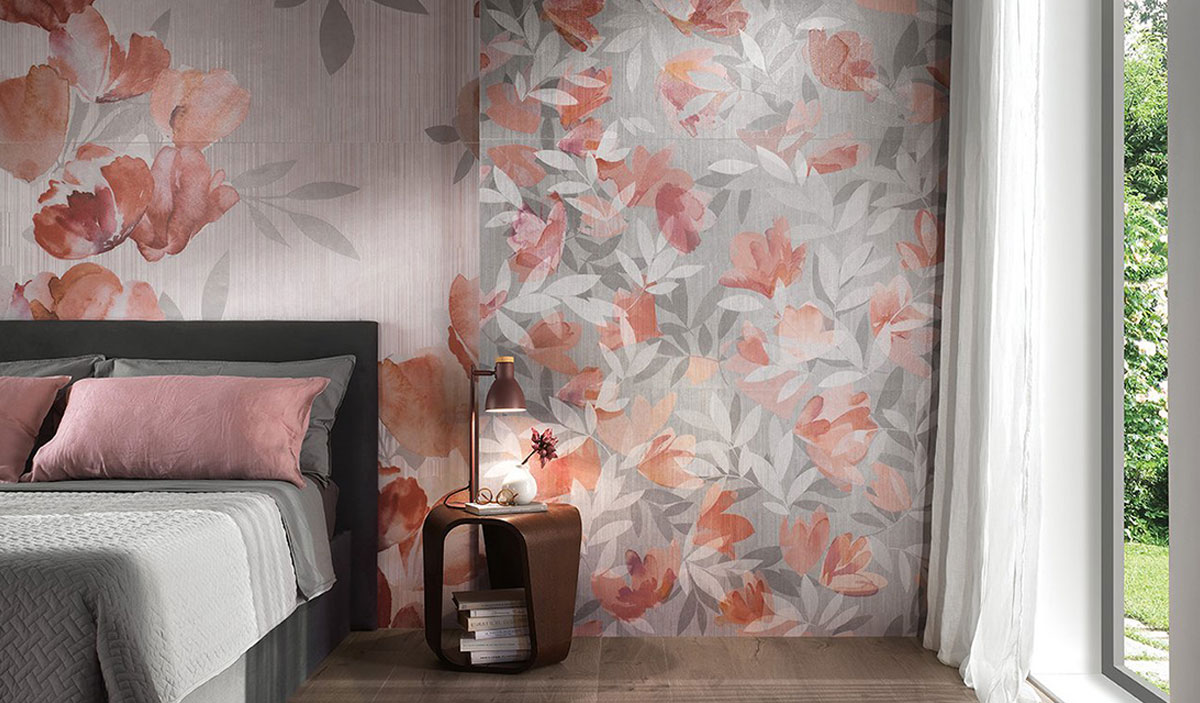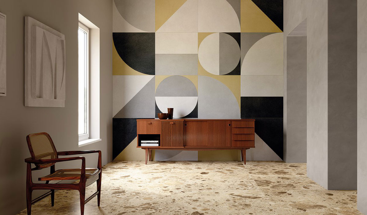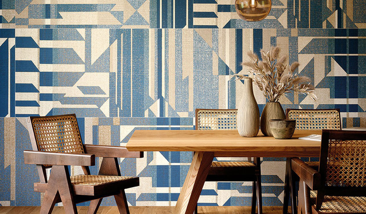
Colour harmony plays a prominent role in contemporary home decor trends, offering very interesting design solutions to create highly stimulating environments that resonate perfectly with the personality of those who live there.
Colour harmony is based on the physics of colour and its ability to absorb and reflect light, and refers to the search for the family of colours that suits us best: “colour friends” that help us look more beautiful and brighter and allow us to fully express who we are.
Colour harmony is not only limited to the art and science of combining colours.
It originated in film, when black and white switched to colour and it was realised that the wrong colour combinations or choices could take away from the realism and expressive power of the film, rather than enhancing it. This prompted new studies on colour to find the schemes most functional for the script, capable of enhancing both the scenes and the stars of the film.
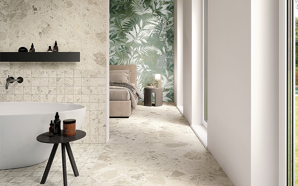
From cinema to fashion and makeup, colour harmony also arrives in our interiors to create environments that literally enhance us, and make us feel good about ourselves, both mentally and physically!