Decorate your home with colour harmonies: Summer
Back

Decorate your home with colour harmonies: Summer

Decorate your home with colour harmonies: Summer

Colour harmony plays a prominent role in contemporary home decor trends, offering very interesting design solutions to create highly stimulating environments that resonate perfectly with the personality of those who live there.

Colour harmony plays a prominent role in contemporary home decor trends, offering very interesting design solutions to create highly stimulating environments that resonate perfectly with the personality of those who live there.

Colour harmony is based on the physics of colour and its ability to absorb and reflect light, and refers to the search for the family of colours that suits us best: “colour friends” that help us look more beautiful and brighter and allow us to fully express who we are.

Colour harmony is not only limited to the art and science of combining colours.
It originated in film, when black and white switched to colour and it was realised that the wrong colour combinations or choices could take away from the realism and expressive power of the film, rather than enhancing it. This prompted new studies on colour to find the schemes most functional for the script, capable of enhancing both the scenes and the stars of the film.

From cinema to fashion and makeup, colour harmony also arrives in our interiors to create environments that literally enhance us, and make us feel good about ourselves, both mentally and physically!
Summer home decor

Contrary to what one might instinctively think, summer colours are cool and fluid. Very delicate powdery colours with a cool base: muted greys and blues, shades of lavender, very soft yellows and greens. A truly sophisticated palette, often used tone-on-tone. Summer therefore suggests combinations of elegant complementary colours, but also shimmery colours typical of this season.

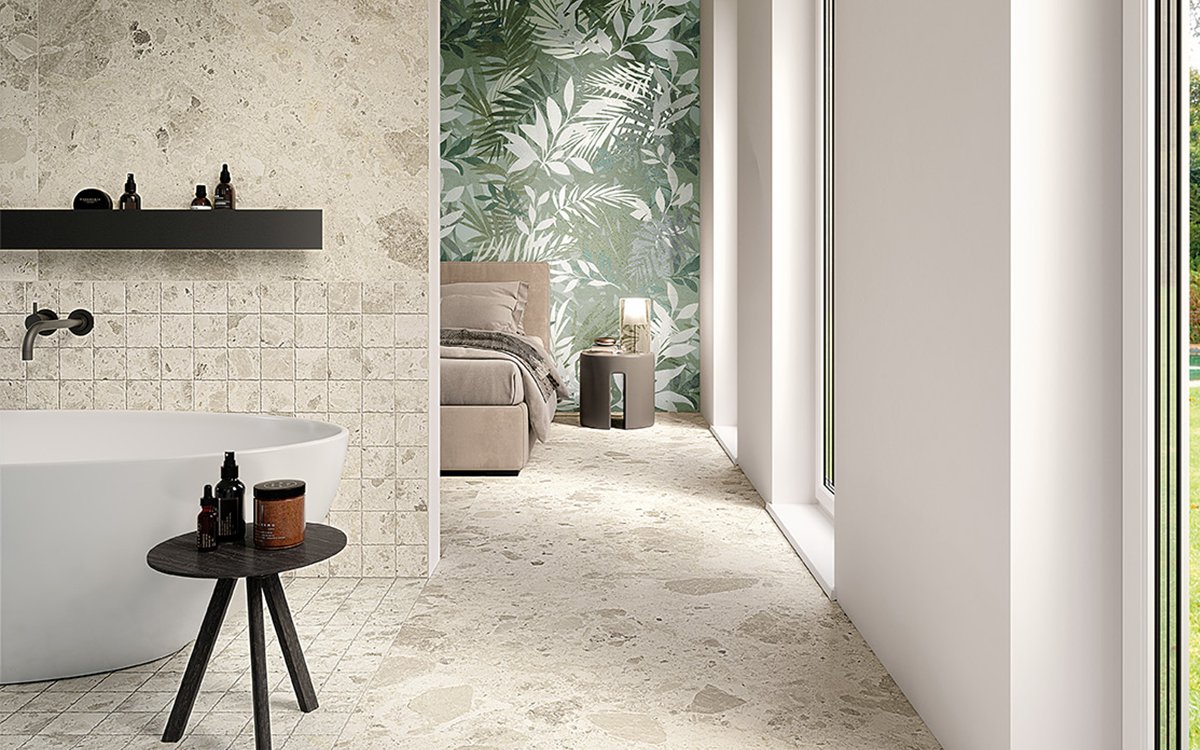
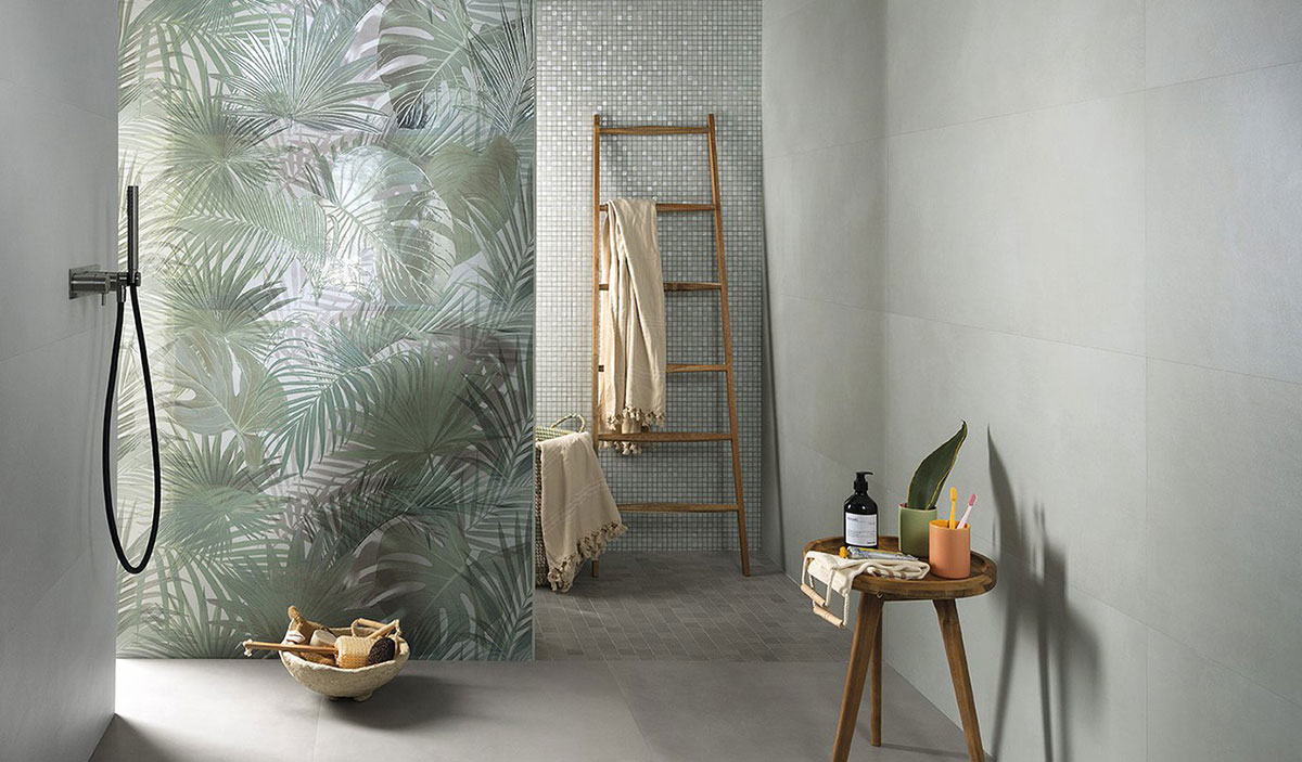
Emblematic for summer is the Jungle Chic style of Milano Mood Tropical Verde, a ceramic decoration that satisfies the need for nature and greenery, characterised by delicate shades of colour that overlap with each other to add a sense of depth and a feeling of coolness. “It almost feels like morning dew,” suggests Ilaria Pizzoferrato, Image Consulting & Trend Forecasting – before the burst of a summer day.

The clever and delicate use of colour, warm green shades mixed with cooler ones, make Milano Mood Tropical Verde very versatile, suitable for both a cool season like summer and a warm season like spring! The shades and nuances of this wall tile perfectly match stoneware surfaces and floors in cool colours such as green, aquamarine and neutral pastel shades with a grey patina.

Summer colors and style

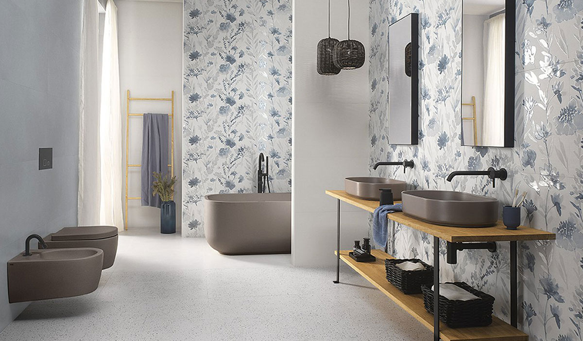
Summer is also associated with shimmery hues, reflections on water, sparkles… which can be found in another decoration of Milano Mood: Flower Blu. These cold and matt wall tiles decorated with blue flowers in relief seem to incorporate the beautiful light of a luminous glossy effect that adds body and dimension to the petals.

This extraordinary ceramic effect is the result of extensive aesthetic and technological research, now a hallmark of FAP Ceramiche.

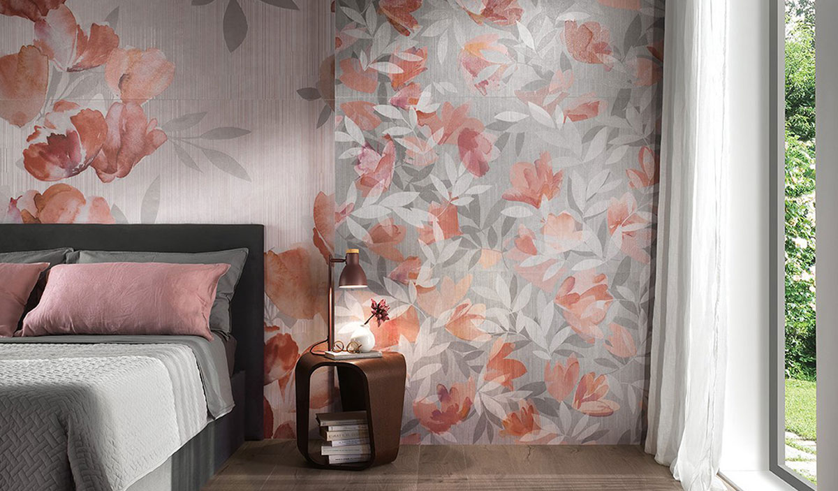
FAP Murals Flower Soft offers a different and always extremely pleasant interpretation of the floral theme: very delicate and sophisticated textures in powdery shades of grey, white and pink, very elegant and remarkably relaxing.

The petals almost seem to rest on the walls like veils of tulle and organza, very light but capable of creating depth and a striking colour mix.

Summer colors and style

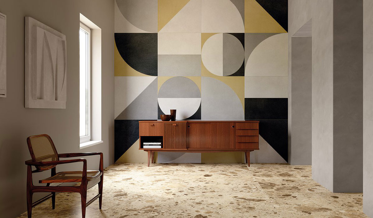
FAP Murals Texture Macro is more rigorous and geometric, marking the space with essential and ultra-modern forms of pure design with blocks of colour that fade into veils of grey.

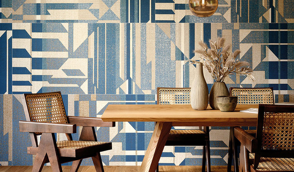
In summer, of course, there is no shortage of shades of blue, set against powdery and mother-of-pearl nuances to create a pleasant contrast of light and colour, as in FAP Murals Texture Kilim: a ceramic carpet that evokes ancient Persian weaves and makes the room enveloping thanks to shades of cool blues and more intense blues, enlivened by a metallic patina that adds luminosity to Kilim’s geometric pattern.

Summer colors and style