A colour that encourages true relaxation and focus, allowing the mind to wander and creativity to breathe, making room for innovation.
Laurie Pressman, Vice President of the Pantone Color Institute
Regresar
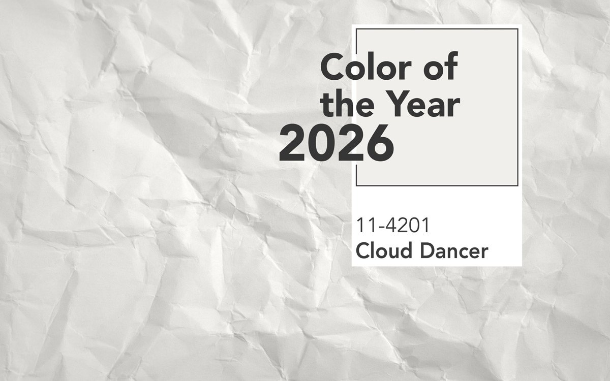
Cloud Dancer: the Pantone Colour of the Year is the new neutral shade for interior design
It goes well with everything, especially with the Fap collections: this is the new Pantone colour of the year 2026
2026 is denoted by chromatic lightness of touch with Cloud Dancer, the new Pantone colour of the year. An ethereal, versatile, luminous shade, imbued with light and a sense of balance, that harmonises attractively with every colour palette and interior design style.
Cloud Dancer: making neutral colour contemporary
The Pantone colour of the year has always shaped design trends, influencing the materials, finishes and moods of home design.
This year, Pantone has surprised us with an unexpected colour, a neutral white that seems to embody a deeply felt, shared need for serenity, purity and harmony.
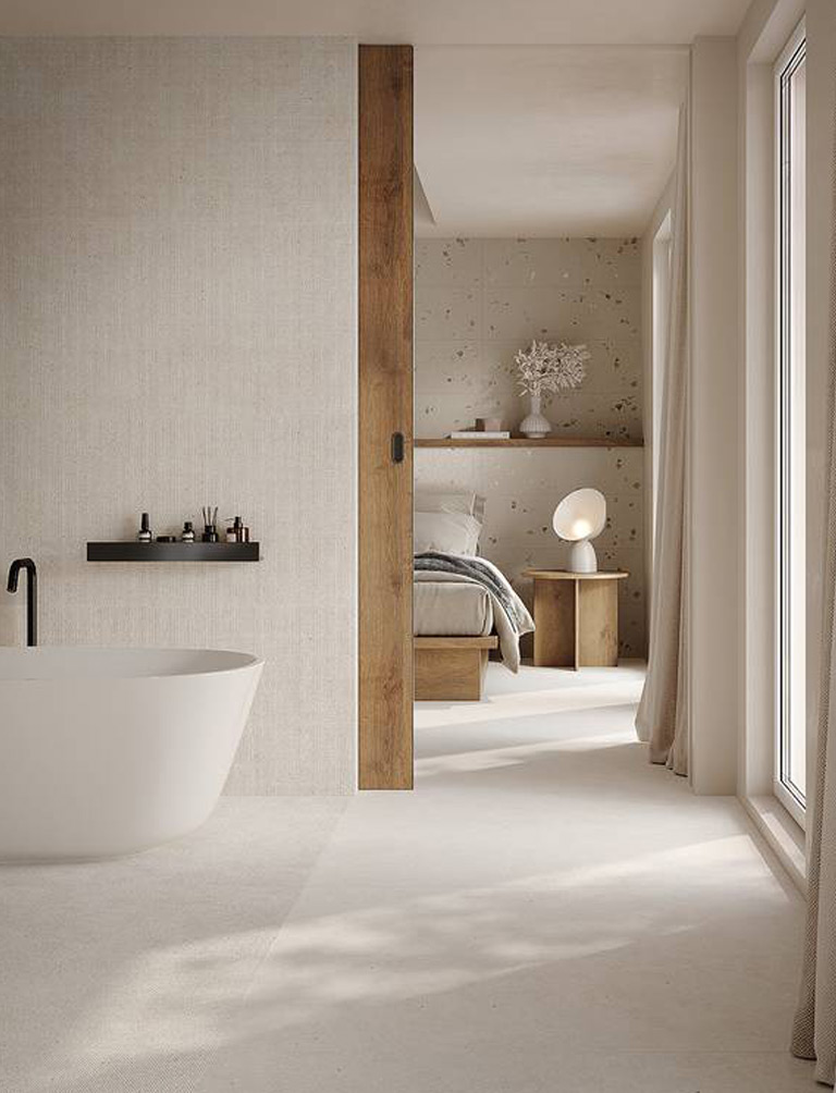
A perfect shade for creating airy interiors and highlighting characterful surfaces, which dialogues perfectly with the textures, materials and finishes of the Fap collections, transforming every space into a unique, contemporary sensory experience.
The language of neutral white colour
The language of neutral white colour expresses purity, neutrality, order and balance. It communicates sensations of tranquillity, calm and peace, creating mental space and clarity.
It’s a kind of “visual silence” that responds to the saturation and speed typical of our age.
In fact, according to the Pantone Color Institute it serves as “a symbol of calming influence in a society rediscovering the value of quiet reflection". “It opens up space for creativity, allowing our imagination to drift so that new insights and bold ideas can emerge and take shape”.
Why Cloud Dancer goes well with everything
The new Pantone colour of the year 2026 goes well with everything because it’s classified as a neutral white, in spite of its rich shade variations.
Its actual hue is finely judged, midway between pale blue and ivory, so it’s not too cold. This chromatic balance makes it perfect for combinations with both warm and cool colours.
So in stylistic terms, the Pantone of the year 2026 is extremely adaptable, pairing well not only with natural colour palettes, woods, stones and metals but also with bright or saturated shades, providing a note of cleanliness and modernity.
It contributes a light airiness to interiors, illuminates space and emphasises the beauty of other colours or materials.
It’s particularly contemporary, ideal for minimalist, modern and luxurious interior designs. Perfect for white and 3D decorative walls.
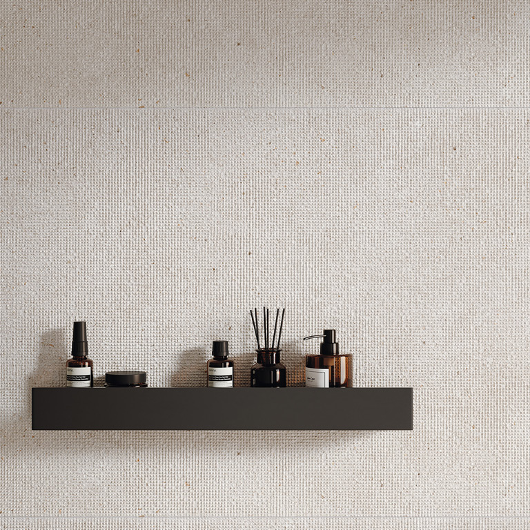
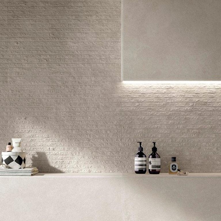
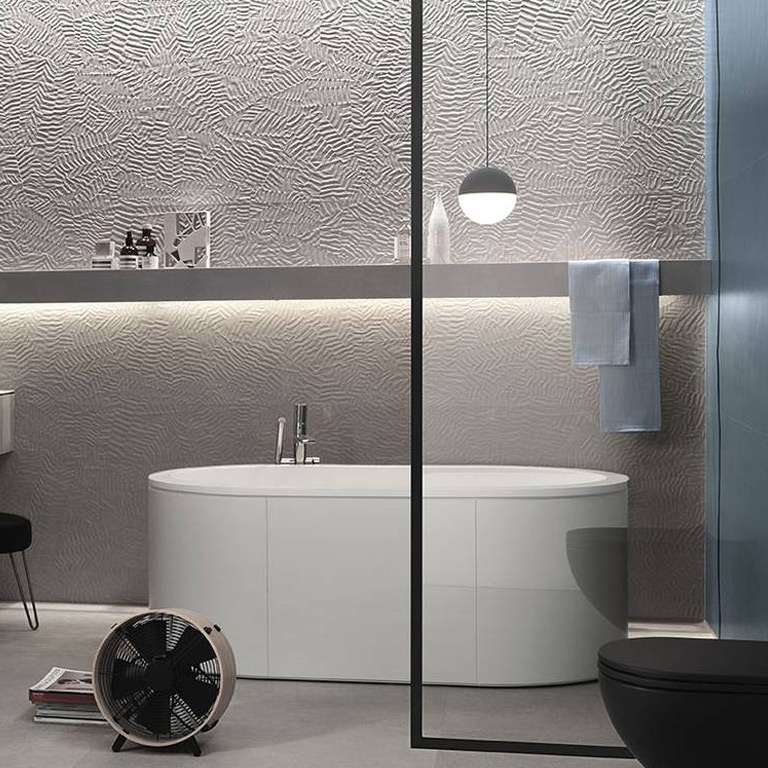
Corrugated white and ceramic surfaces: colour becomes matter
Pantone 11-4201 Cloud Dancer isn’t a flat white: this dancer in the clouds is a chameleon-like shade that we like to combine with a corrugated white, with a wealth of slight variations and subtle, flowing relief patterning.
The colour of the year is easy to interpret in ceramics, in a variety of forms as vibrant, tactile and changeable as the Pantone shade itself.
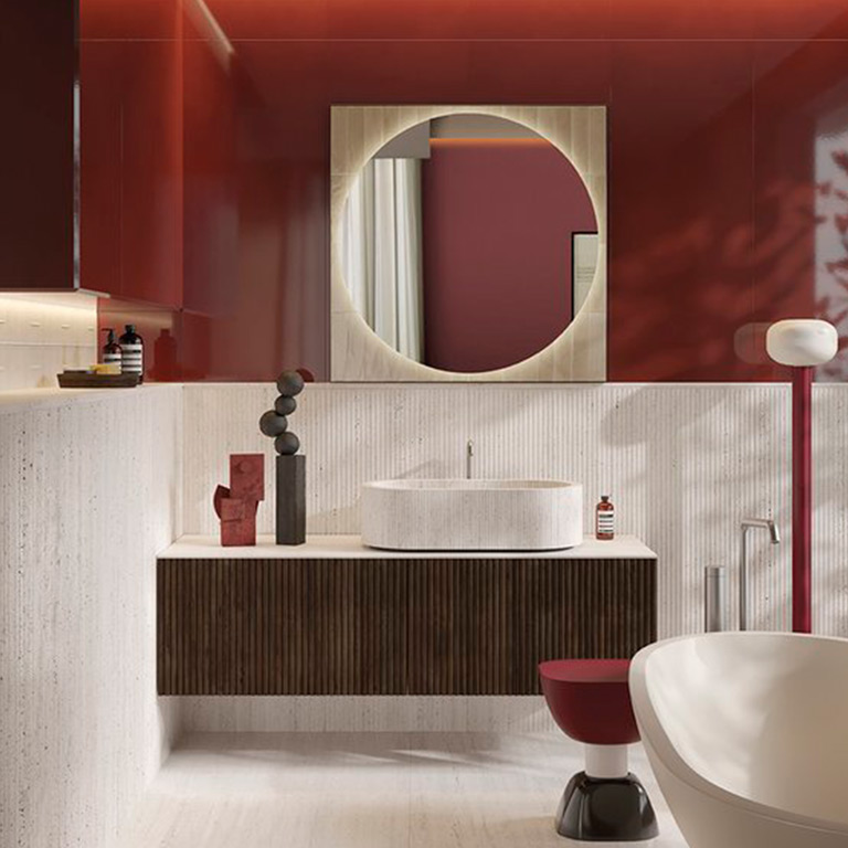
Combinations, trends and brick tiles
Nobu Raw White is the perfect combination of the Pantone colour of the year 2026 and the current trend for brick tiles.
Future colour scenarios
In a design world increasingly oriented towards wellbeing and harmony, the Pantone 11‑4201 Cloud Dancer white is undoubtedly destined to take centre stage.
In floor and wall tiles the shade isn’t merely neutral: it becomes a luminous backdrop against which textures, materials and interactions with the light reach their full potential, for the creation of interiors with a mood of calm, balance and timeless modernity.
Looking to the future, we can expect white not to disappear but rather to be transformed into a creative tool, fully equipped to dialogue with any project or colour trend.