Colour combination for interior design: colour blocks or tone-on-tone nuances? When and why to choose one or the other.
Colour combination for interior design: colour blocks or tone-on-tone nuances? When and why to choose one or the other.
What are the right colour contrasts, matchings and combinations in Interior Design? There is no one right answer; what counts is that the style, like the colour combination, reflects our desires and strikes the right chord!
But how to find the ideal colour palette?
A picture, a vintage piece of furniture, an object found in a street market, a rug bought on holiday... whatever is of real inspiration can become a central furnishing feature: the starting point of an interior design project.
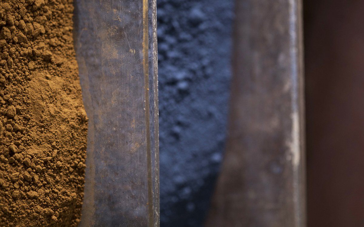
The shapes and colours of the material can suggest many associations, and therefore help to compose the right colour palette for furnishing the home. Let’s see together the different options for creating a colour palette.
In the absence of a clear inspiration that defines our authentic palette, we can turn to the 2023 interior design trends which suggest a naturalistic palette, dominated by olive green and by the warm colours of materials like stone, brass, botanic elements and scenic wall tiles.
Alternatively, we can follow the rules for combining colours suggested by Ilaria Pizzoferrato, Image Consulting & Trend Forecasting who guides us in the discovery of future interior design trends and the secrets of Colour Harmony with her column Fap for Your Style!
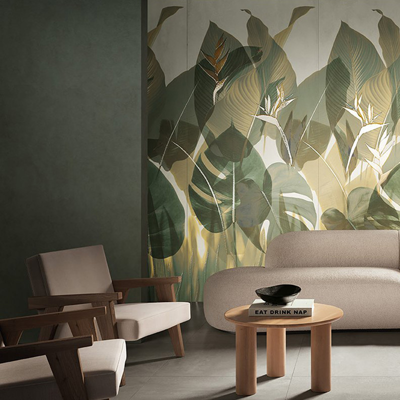
While the choice of tone-on-tone nuances for walls and items of furniture creates harmony on the one hand, with the passing of time this could become boring, unless the linearity is interrupted by disturbing elements: accessories, design elements, lamps or eccentric strong-coloured fabrics, which therefore require a neutral or naive setting in order to dominate the space.
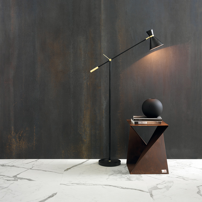
If the choice is for tone-on-tone, the best approach is to give the setting something unexpected and disruptive: a backdrop or an entire wall covered with decorative and characterful wall tiles such as Ylico, the gentle concrete-effect collection, coordinated with particularly textured and richly coloured floors in porcelain stoneware, combining the palette of colours or matching different chromatic shades.
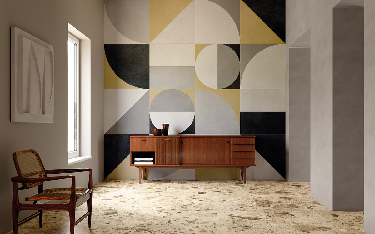
Decisive, composite, plain-coloured, geometric… The colour block is one of the most appreciated trends, from fashion to design; after all, it boasts noble origins. Specifically, it refers to Neoplasticism, the artistic movement introduced by Piet Mondrian, characterized by sharp and rigorous geometries and paintings with primary colours.
Lovers of retro style and 1970s design will adore the Texture Macro colour block which, thanks to the 80x160 format, makes it possible to characterise a whole wall with only three or four elements. Those who like a modern, essential or industrial style, on the other hand, can compose hyper-glamour colour blocks with wall tils with an oxidized effect, full of colour and with a rough aesthetic.
The metal-effect colour block in porcelain stoneware is a strong choice, not only from a colour point of view. The oxidation of the wall tiles enhances the material and enriches the colour with nuances, streaks, imperfections, mineral residues, which lend the surfaces a touch of raw chic, ideal for contemporary and elegant settings, both residential and contract.
The colour block is a style that fits in with any environment, also those dedicated to wellbeing and self-care.